


Matplotlib is one of the most popular library for data visualization and that’s for a reason. It has so many features to offer and can be used without any external software except python and the matplotlib library.
In this article, you will learn how to use matplotlib to visualize data that will also enable you to better understand the data, extract information, and make more effective decisions.
Before going further into matplotlib, let’s talk about Data Visualization
What is Data Visualization?
“A picture is worth a thousand words.” We are all familiar with this expression. It especially applies when trying to explain the insights obtained from the analysis of increasingly large datasets. Data visualization plays an essential role in the representation of both small and large-scale data.
Data visualization is the graphical representation of information and data. Graphical representation(in the form of charts, graphs, and maps etc) allows us to better understand the relationship in the data, data visualization tools provide an accessible way to see and understand trends, outliers, and patterns in data
One of the key skills of a data scientist is the ability to tell a compelling story, visualizing data and findings in an approachable and stimulating way.
Prerequisites: – Python and Data Cleaning with Python Pandas
Exploring Datasets With Pandas
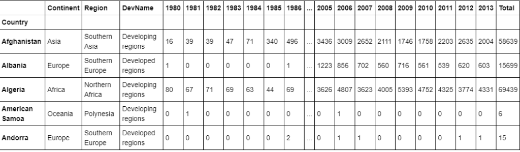
The dataset contains annual data on the flow of international immigrants as recorded by the countries of destination. The data presents both inflows and outflows according to the place of birth, citizenship or place of previous / next residence both for foreigners and nationals. The current version presents data pertaining to 45 countries.The dataset is available here.
Downloading and Preparing Data
import pandas as pd #For reading the data
#Read the dataset skipping top 20 rows(irrelevant) and second last row
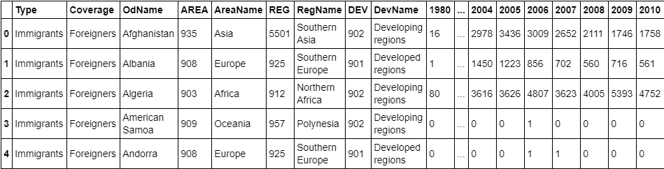
df_canada = pd.read_excel("./data/canada.xlsx",skiprows = range(20),skipfooter=2) df_canada.head() #View top 5 rows

#Check the dimensions of our canada dataset
df_canada.shape # (195, 43)
#Let gets insight of our dataset
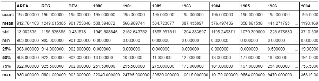
df_canada.describe()

Cleaning the Dataset
Remove columns that are not informative to us for visualization(eg., type, area, reg)
df_canada.drop(["AREA","REG","DEV","Type","Coverage"],axis = 1, inplace = True)
#View columns of our dataset
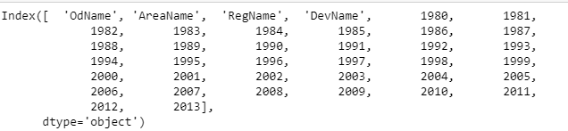
df_canada.columns

Renaming Columns
df_canada.rename(columns={"OdName":"Country","AreaName":"Continent","RegName":"Region"},inplace = True)
#View columns of our dataset
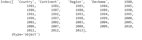
df_canada.columns

Check if column labels are string
For consistency, make sure that all column labels are of type string.
# let's examine the types of the column labels
all(isinstance(column, str) for column in df_canada.columns)
#False

df_canada.columns = list(map(str,df_canada.columns))
# let's examine the types of the column labels
all(isinstance(column, str) for column in df_canada.columns)
#True
Set the country name as index – useful for quickly looking up countries using .loc method.
df_canada.set_index("Country",inplace=True)
Add total column
#Add a column Total in our dataset containing
#total numbers of immigrants
df_canada["Total"] = df_canada.sum(axis=1)

#View top 5 rows
df_canada.head()

Visualizing Data using matplotlib
Now after we have cleaned the dataset, its time to draw some plots. Plotting data using Matplotlib is quite easy. Generally, while plotting they follow the same steps in each and every plot. Matplotlib has a module called pyplot which aids in plotting figure. The Jupyter notebook is used for running the plots. We import matplotlib.pyplot as plt for making it call the package module.
Installing matplotlib
Type !pip install matplotlib in the Jupyter Notebook or if it doesn’t work in cmd type conda install -c conda-forge matplotlib . This should work in most cases.
#import necessary modules
import matplotlib.pyplot as plt

# use the inline backend to generate the plots within the browser
%matplotlib inline
LINE PLOTS
What is Line Plot? When to use Line Plot?
A line chart or line plot is a type of plot which displays information as a series of data points called ‘markers’ connected by straight line segments. It is a basic type of chart common in many fields. Use line plot when you have a continuous data set. These are best suited for trend-based visualizations of data over a period of time.
Let’s Start with a Case Study
In 2010, Haiti suffered a catastrophic magnitude 7.0 earthquake. The quake caused widespread devastation and loss of life and aout three million people were affected by this natural disaster. As part of Canada’s humanitarian effort, the Government of Canada stepped up its effort in accepting refugees from Haiti. We can quickly visualize this effort using a Line plot:
#First, we will extract the data series for Haiti.
years = list(map(str, range(1980, 2014)))
haiti = df_canada.loc["Haiti",years ]

# passing in years 1980 - 2013 to exclude the 'total' column
haiti.head()

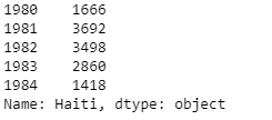
pandas automatically populated the x-axis with the index values (years), and the y-axis with the column values (population). However, notice how the years were not displayed because they are of type string. Therefore, let’s change the type of the index values to integer for plotting.
haiti.index = list(map(int,haiti.index))
Also, let’s label the x and y axis using plt.title(), plt.ylabel(), and plt.xlabel() as follows:
haiti.plot(kind = "Line")     #Plotting the line
plt.title("Immigration of Haiti")
plt.xlabel("Years")
plt.ylabel("Number of immigrants")

plt.show() # need this line to show the updates made to the figure

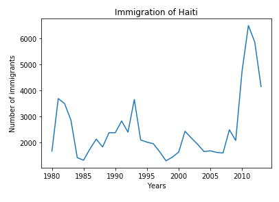
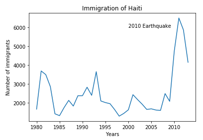
We can clearly notice how number of immigrants from Haiti spiked up from 2010 as Canada stepped up its efforts to accept refugees from Haiti. Let’s annotate this spike in the plot by using the plt.text() method.
haiti.plot(kind = "Line")     #Plotting the line
plt.title("Immigration of Haiti")
plt.xlabel("Years")
plt.ylabel("Number of immigrants")

plt.text(2000,6000,"2010 Earthquake")
plt.show() # need this line to show the updates made to the figure

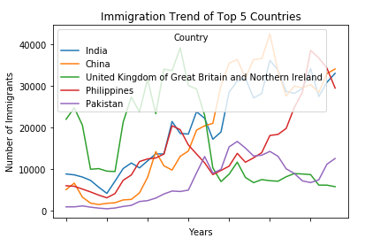
We can easily add more countries to line plot to make meaningful comparisons immigration from different countries.
Lets Compare the trend of top 5 countries that contributed the most to immigration to Canada.
#Sorting the dataset using sort_values() method
df_canada.sort_values(by = "Total",ascending = False, inplace = True)
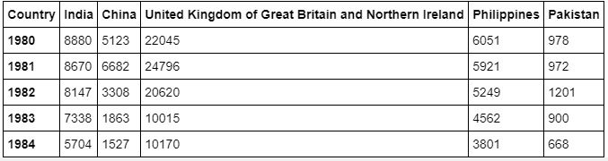
#Extract the data for top 5 countries
years = list(map(str,range(1980,2014)))
df_top = df_canada.head()
#Transpose the dataset
df_top=df_top[years].transpose()
df_top.head()

Now create a line plot and visualize the data
df_top.plot(kind='line')            #Plotting line

plt.title('Immigration Trend of Top 5 Countries')
plt.ylabel('Number of Immigrants')
plt.xlabel('Years')

plt.show()

Final Words
Thank you for the read. I hope that you have enjoyed the article. If you like it, share it with your friends. Also, I have a quick task for you to see how much you have learned.
You can think of it as an assignment.
Task.
COMPARE THE TREND OF LAST 5 COUNTRIES THAT CONTRIBUTED THE MOST TO IMMIGRATION TO CANADA.
I’ll be happy to hear your feedback. If you have some questions, feel free to ask them. 😉